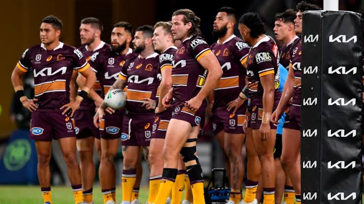
The Brisbane Broncos, one of the most recognized clubs in the National Rugby League (NRL), may soon undergo a significant transformation in terms of their branding. For the first time in nearly a quarter of a century, the club is reportedly exploring a possible rebrand, highlighted by the recent submission of a new logo design to IP Australia, the federal agency that manages intellectual property rights in Australia.
This new logo, a sleek and minimalistic horse head emblem, diverges notably from the Broncos’ current and historical branding. The image, at this stage presented only in black and white, represents a streamlined and simplified aesthetic. While the current design lacks color, it is widely expected that any finalized version will include the club’s signature maroon, white, and gold hues, which have been central to its identity since its founding.
A spokesperson for the Broncos confirmed to news.com.au that the club has submitted the new logo for trademark registration. However, they emphasized that the application has not yet been approved, accepted, or officially registered. The statement acknowledged the logo as a newly developed corporate design, indicating that it may be part of broader strategic efforts within the organization.
This shift in branding mirrors a global trend in professional sports where organizations are modernizing their visual identities to appeal to contemporary audiences. Today’s branding approaches favor clean lines, bold color schemes, and minimalist imagery over intricate, cartoon-like emblems of the past. These updated logos are particularly well-suited for digital platforms and modern merchandise, as they are easier to reproduce and scale across various media.
In the world of NRL, the Broncos are not alone in this approach. Several other clubs, such as the Canterbury-Bankstown Bulldogs and the Wests Tigers, have already reimagined their logos in recent years. These updates are typically designed to reflect modern aesthetics while preserving essential aspects of a team’s heritage and symbolism. The Bulldogs and Tigers retained key motifs and color schemes to ensure continuity and recognition among long-time fans, even as they adopted more current and versatile designs.
The Broncos’ current logo, which has served the club for over two decades, was introduced in 2000. It saw a minor refinement in 2006. That version replaced the team’s original logo from their debut season in 1988. The 1988 emblem also featured a stylized horse’s head but in a more elaborate and traditional artistic format. The consistent use of a horse motif reflects the club’s name and identity, with the animal representing power, speed, and endurance—all values closely associated with the team’s ethos on the field.
Recent moves by the Broncos suggest that the club is actively embracing change across multiple fronts, not just in branding. For example, earlier in the 2025 season, the team introduced a striking black jersey in a match against the Gold Coast Titans. This departure from their traditional uniform color scheme was not merely a stylistic choice—it was part of a mental health awareness initiative linked to the NRL’s Mental Health Round.
The black jersey, paired with matching shorts and socks, was developed in collaboration with the Black Dog Institute, the Broncos’ charity partner. It symbolized solidarity and support for mental health advocacy, and proceeds from the jersey’s sales are being donated to the institute. This initiative showcased the club’s willingness to use its platform for social good, while also signaling a broader openness to innovation and reinvention in its public image.
The potential introduction of a new logo now adds another layer to this pattern of forward-thinking evolution. While it remains unconfirmed whether the logo will appear on the Broncos’ jerseys as early as next season, its trademark submission points to a deliberate move toward a brand refresh that may be fully implemented by 2026. Given the time required for trademark processing, design finalization, and merchandise rollout, the timeline aligns with the kind of long-term planning typical of major sports organizations.
A shift in logo design may also reflect an internal reassessment of how the club wants to be perceived in the modern sports landscape. Today, branding is more than just a logo on a jersey; it is a statement of identity, a marketing tool, and a vital component of fan engagement. Simplified logos tend to perform better across digital media, particularly on social networks and e-commerce platforms where clear, memorable designs are more effective. This digital compatibility is likely one of the driving forces behind the Broncos’ exploration of a more modern logo.
Additionally, rebranding can be a way to re-energize the fan base and attract new supporters. As teams compete not only on the field but also in the business aspects of sports—ticket sales, merchandise, sponsorship, and broadcast deals—a refreshed and modern visual identity can make a significant difference. It also offers fresh opportunities for launching new apparel lines, reimagining team merchandise, and expanding global outreach, especially as the NRL looks to grow its audience domestically and internationally.
Even with these forward-looking changes, it’s expected that the Broncos will maintain key elements of their heritage, especially their color scheme and horse-related iconography. These features are deeply embedded in the club’s history and brand recognition, and a complete departure from them would risk alienating long-time supporters. Therefore, any new design is likely to balance innovation with tradition, reflecting both where the club has been and where it aims to go.
Ultimately, while the final decision regarding the new logo’s adoption remains pending, its submission marks an important step in what could be a new chapter for the Brisbane Broncos. Whether or not the redesign is officially adopted and widely used, the move illustrates a growing awareness within the organization about the evolving nature of sports branding and the need to stay relevant in an increasingly competitive environment.
This logo submission is more than a simple design change—it symbolizes an organization willing to adapt, modernize, and align itself with contemporary trends without forgetting its roots. The full impact of this potential rebrand will unfold in the months to come, but it already suggests that the Broncos are preparing to position themselves strongly, both visually and strategically, for the seasons ahead.